Work IRL
IRL: Rebuilding Product Architecture
Series C startup. The team scaled, the product didn't. My job was to bring it back together.
00. tl;dr
- Context
Series C consumer social. Fast scaling, severe cross-platform fragmentation.
- Role
Staff Product Designer (IC). Owned system-level decisions across iOS, Android, and Web.
- Work
Designed zero-to-one surfaces while turning recurring decisions into shared rules.
- Impact
Replaced ad-hoc UI with a shared system layer. Less drift, more predictable delivery.
01. Intro
What I walked into
When I joined, the design team had scaled quickly. Talent wasn't the gap - the roster included ex-Meta and ex-Instagram designers, and the company had momentum and serious funding behind it. What was missing was a shared system to turn that effort into a coherent product.
UI inconsistency was only the symptom. The real issue was the absence of a system layer - a shared model for how interfaces should behave, scale, and ship.
The symptoms were consistent:
- no single source of truth
- teams recreated the same patterns independently
- state and behavior drift across surfaces and platforms
- exceptions became the default
- handoff ambiguity in specs
02. The Bet
System work and feature work had to happen together, by the same hands.
Decoupling them was the failure mode I'd seen elsewhere - systems built in isolation that no one adopted, or features shipped on top of patterns that quietly drifted apart.
I made the call to do both in parallel. The system would be validated against real product complexity as it was being built. The features would extend the system instead of bypassing it. The two tracks fed each other.
The goal was adoption without bureaucracy: make the right thing the default.
The system had to:
- align iOS, Android, and Web without forcing identical visuals
- define shared rules for hierarchy, states, and interaction behavior
- work with existing surfaces without slowing delivery
- give engineering clear specs and a single source of truth
- scale from primitive tokens to high-complexity product surfaces
That bet shaped everything below.
03. System
I built the system layer in parallel with product work.
I traced where fragmentation caused the most churn, then turned those repeated decisions into shared rules. Recurring interface logic became explicit, so new work didn't become one-offs.
Semantic Token Framework
A three-layer token model: primitives → semantic tokens → component aliases.
Primitives stored raw values. Semantic tokens captured intent. Component aliases translated that intent into specific components, states, and platforms - so the system could evolve without breaking product logic.
One example: a user-color token model for chat surfaces. Polls, prompts, and shared objects inherited the author's identity color through aliases rather than per-screen styling. The behavior became part of the system.
Platform-adaptive typography
Swappable typography libraries - San Francisco for iOS, Roboto for Android - kept hierarchy aligned while each platform respected native conventions.
Component specs and state model
Component anatomy, states, and behavior were standardized early, so variation happened by rule instead of interpretation.
Accessibility by default
Accessibility lived in the system layer: contrast-audited semantic tokens, WCAG AA as the baseline, AAA variants where needed, and native hit-area standards across iOS, Android, and Web.
04. Code sync
I turned design decisions into a versioned source of truth.
Tokens were authored in Figma, synced to Git through Tokens Studio, and stored as versioned JSON. All three platforms consumed the same source. Updates moved through pull requests, not Slack messages.
This gave design and engineering a shared, versioned source for decisions that used to drift between Figma and code. Token changes shipped like code changes - reviewed, versioned, and traceable. Engineering stopped reverse-engineering Figma. Design stopped chasing implementation drift.
05. Components
The component library made the system usable in day-to-day product work. Shared rules became reusable building blocks with defined anatomy, constraints, and behavior.
Adoption happened through real product work: quick walkthroughs with senior designers, then 1:1 sessions where mid and junior designers converted active screens into system examples.
- Component anatomy and statesDefined anatomy, states, and behavior so patterns stayed consistent across surfaces and platforms.
- Variants by ruleVariants followed explicit rules. This kept exceptions rare and made updates easier to roll out.
- Cross-platform alignmentDefined what must match across iOS, Android, and Web (structure and behavior) and what could differ (native conventions).
- Constraints and guardrailsComponents were intentionally constrained to prevent misuse and shorten review cycles.
Documentation
The docs were the contract:
- component anatomy, states, and usage rules
- interaction and accessibility requirements
- layout, spacing, and density rules
- variant dependencies and cross-platform differences
The docs reduced handoff ambiguity and made system changes reviewable instead of interpretive.
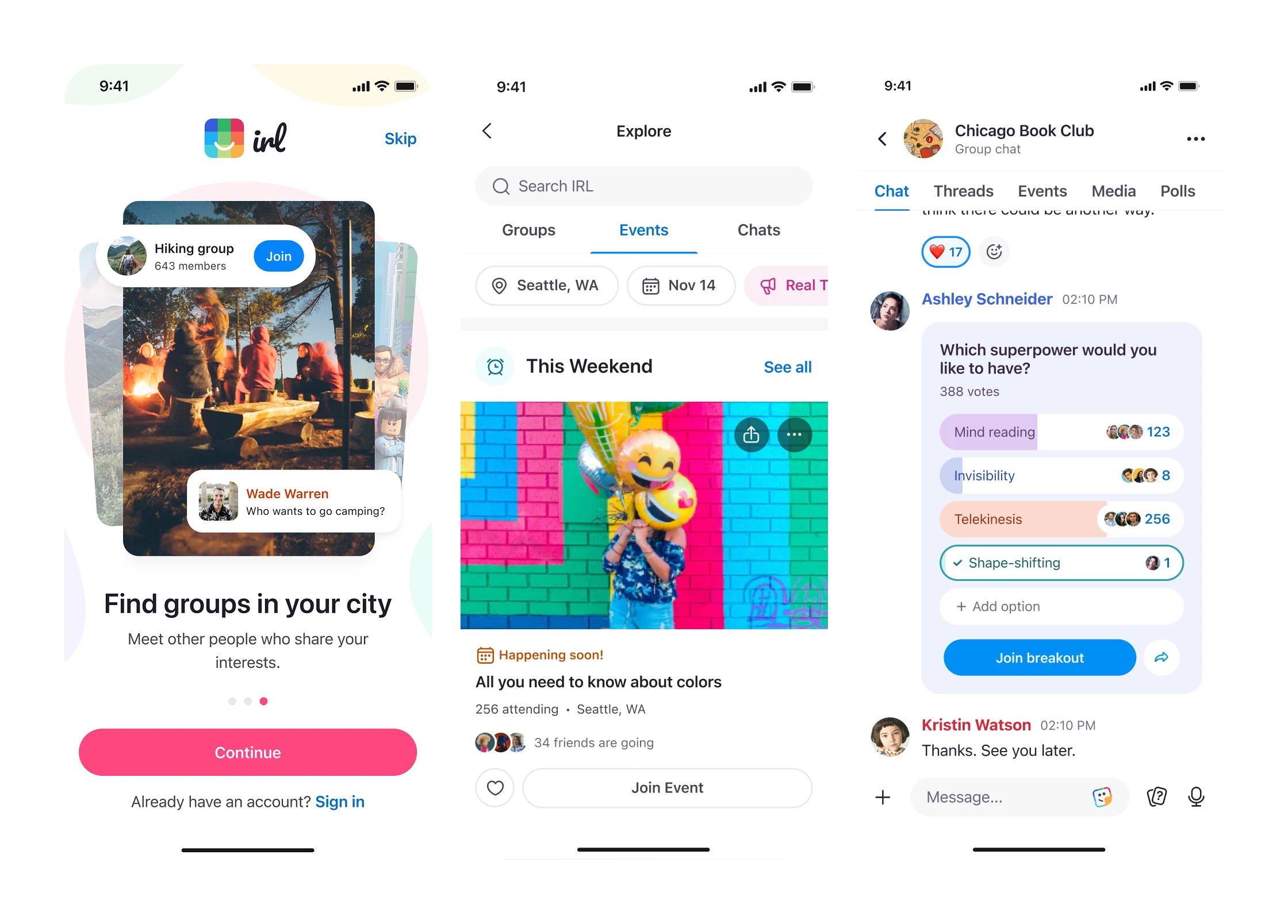
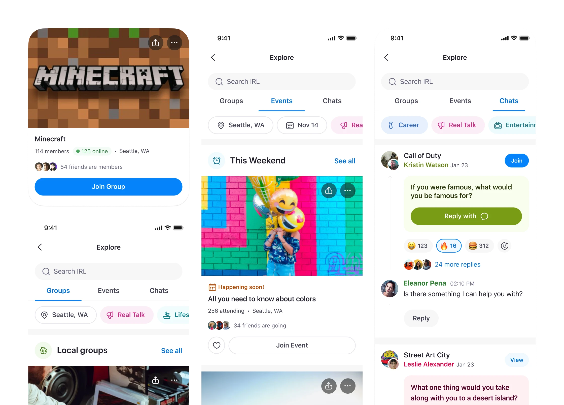
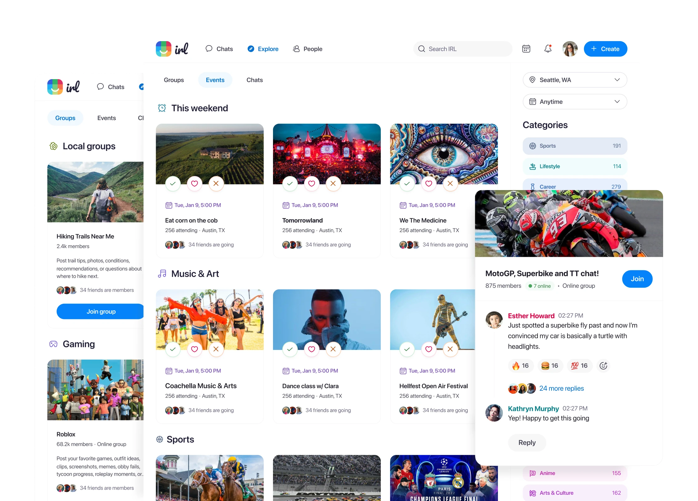
06. Core surfaces
Where the system met real product complexity. Each surface was both a design problem and a stress test of the foundation.
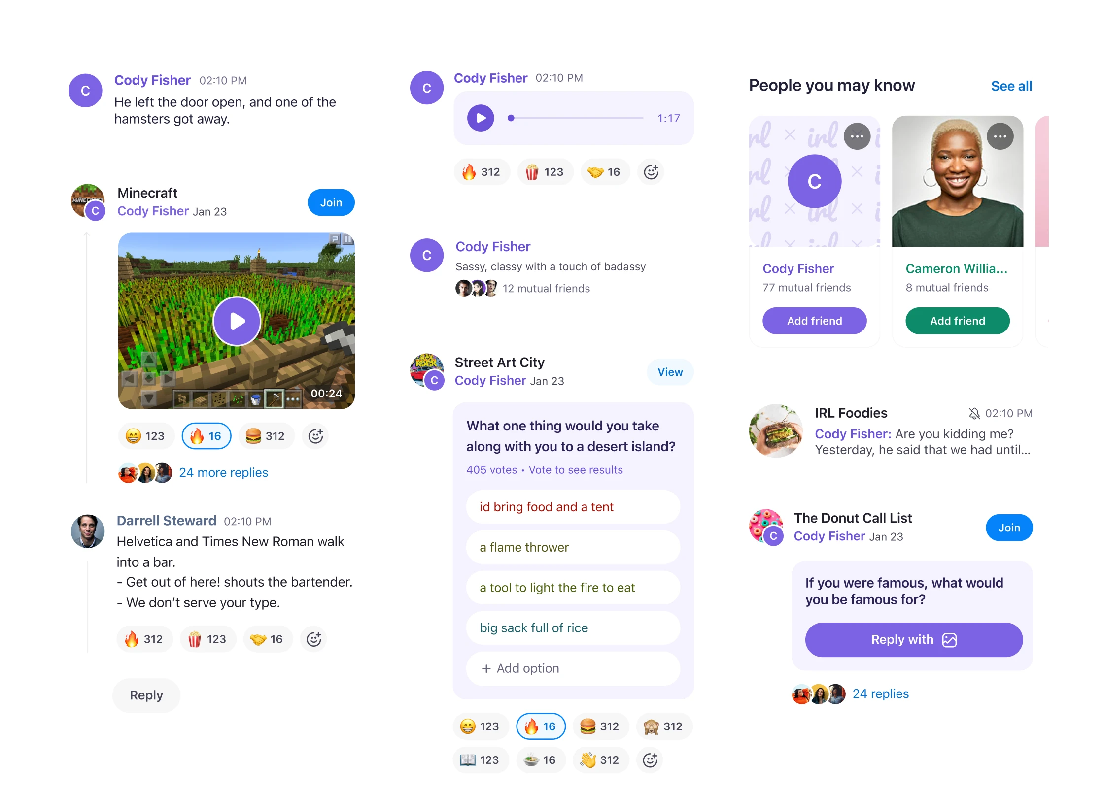
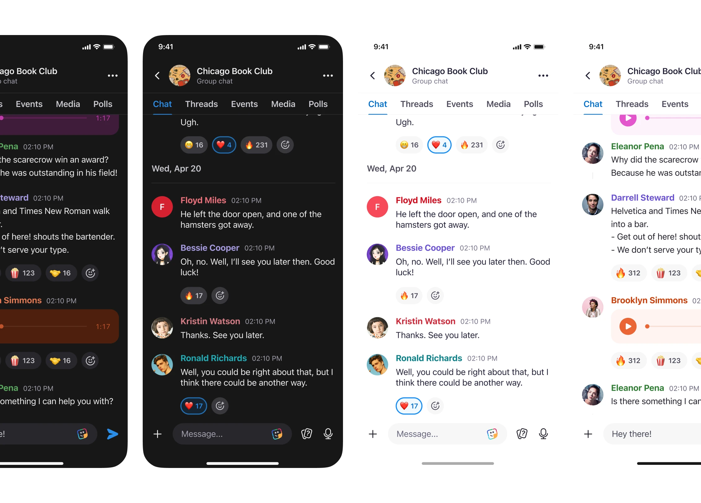
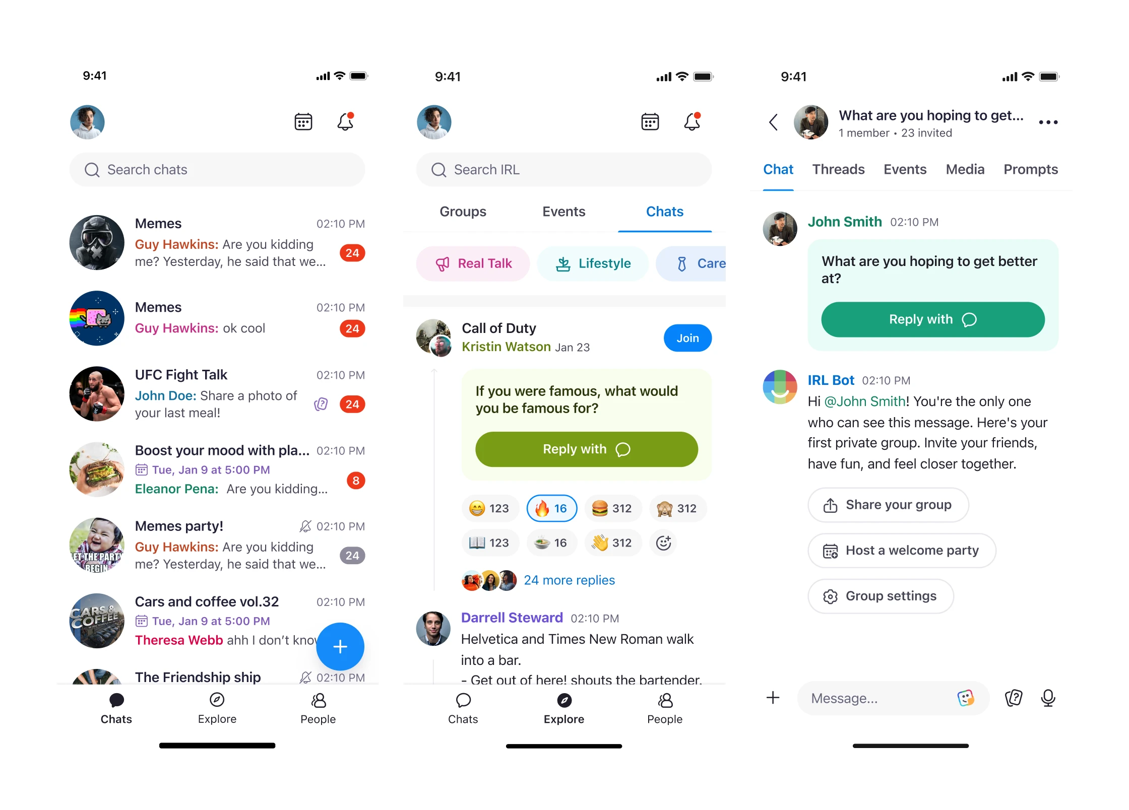
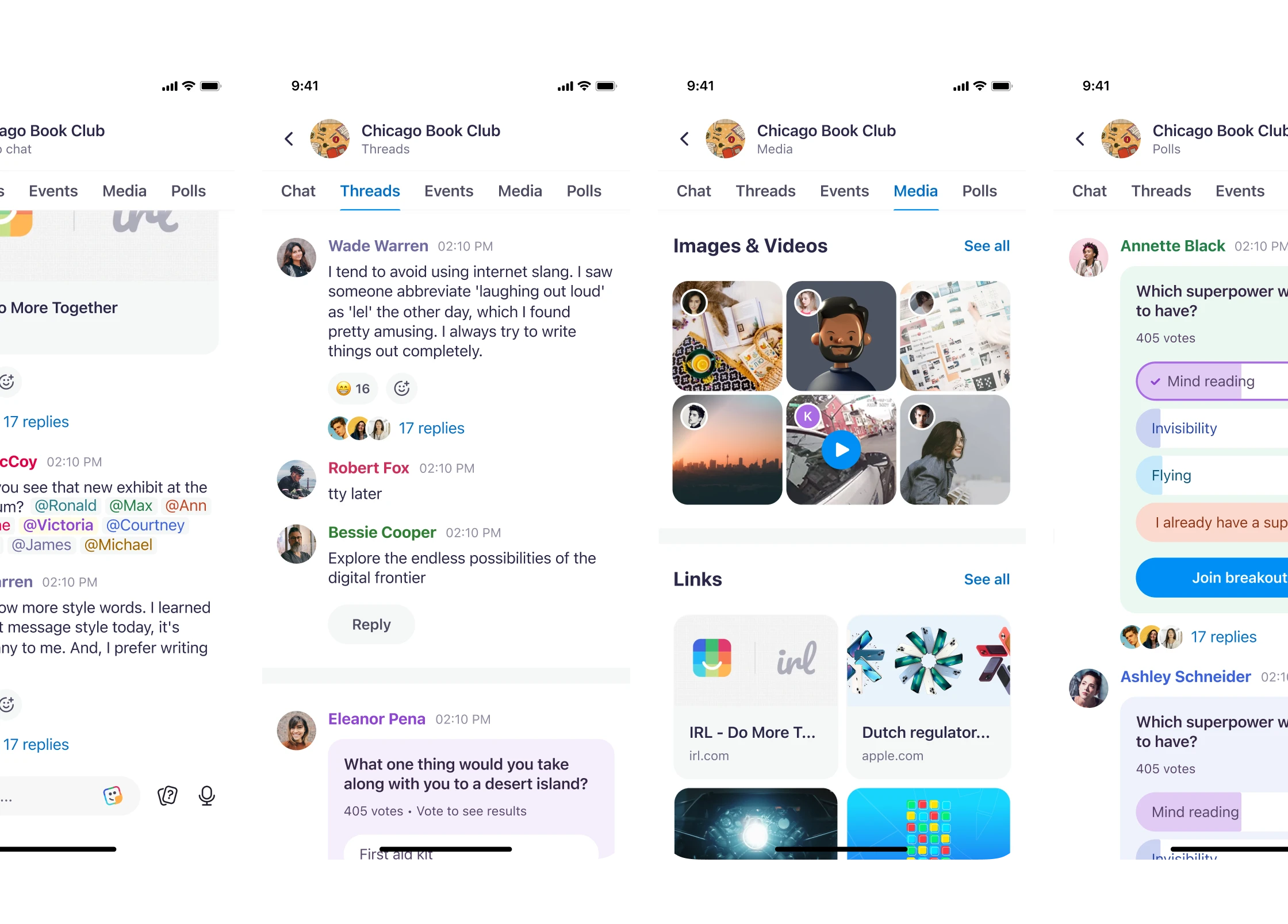
Chat
Redesigned the core chat experience for high-density, structured conversation.
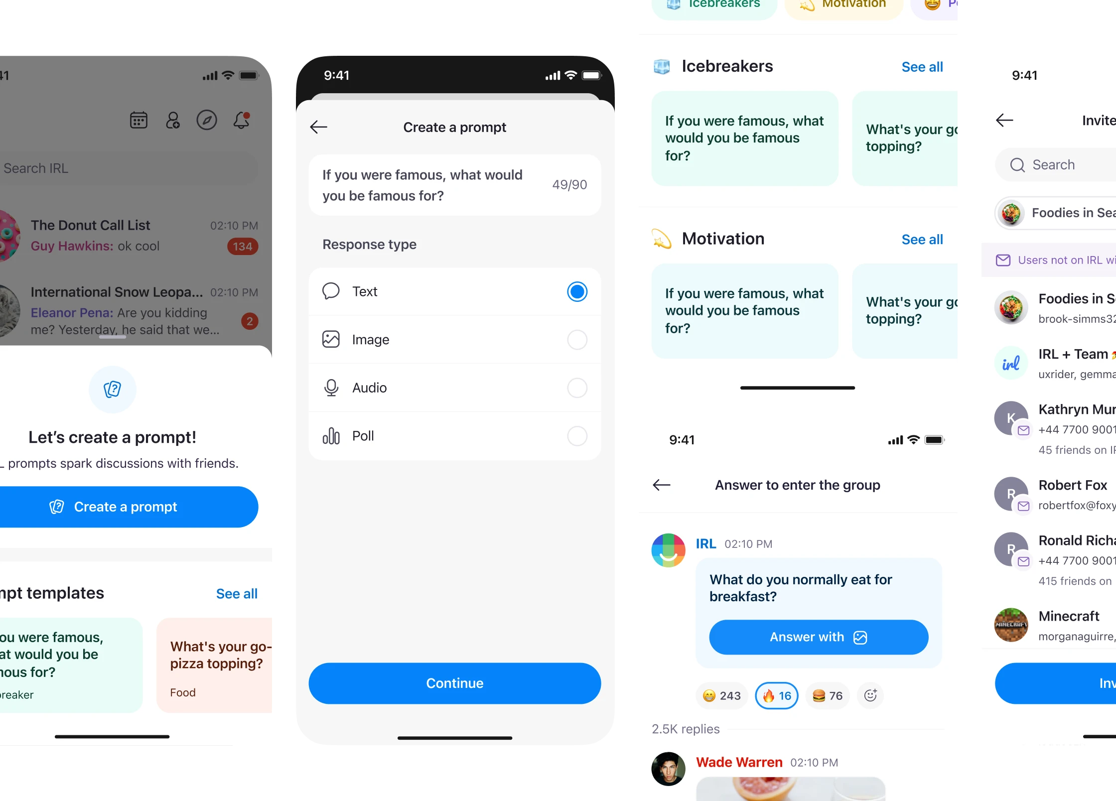
- introduced prompts, polls, and threads to structure conversations at scale
- applied the user-color identity model through the system, so author identity carried into polls and shared surfaces automatically
- standardized anatomy, states, and spacing across message types
Profiles and identity
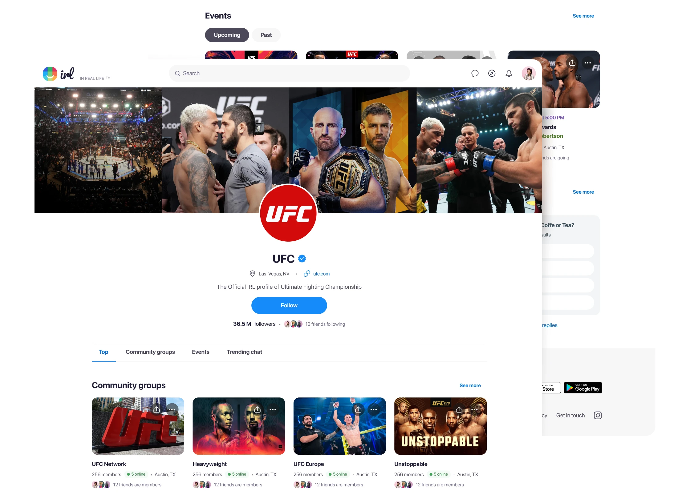
Rebuilt profiles as a scalable identity surface for users and businesses.
- designed business profiles (eg. UFC) as hubs aggregating trending chats, groups, and events
- standardized metadata patterns so new profile types could extend the model without becoming separate systems
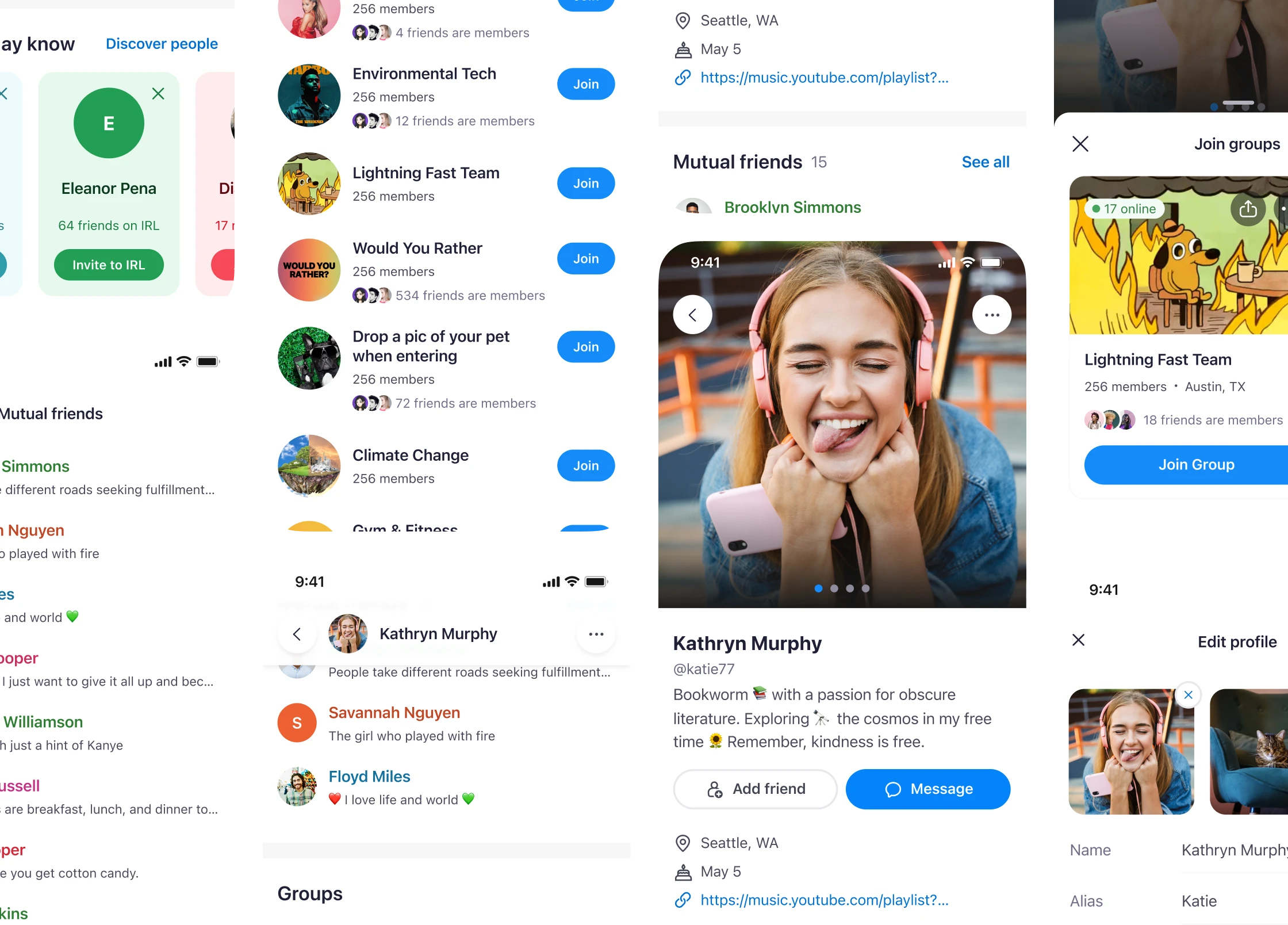
Explore and discovery
Redesigned Explore as a unified discovery surface with centralized search and filtering.
- modular blocks handled mixed content without creating separate interaction models
- search and filtering worked across content types: one model, multiple block types
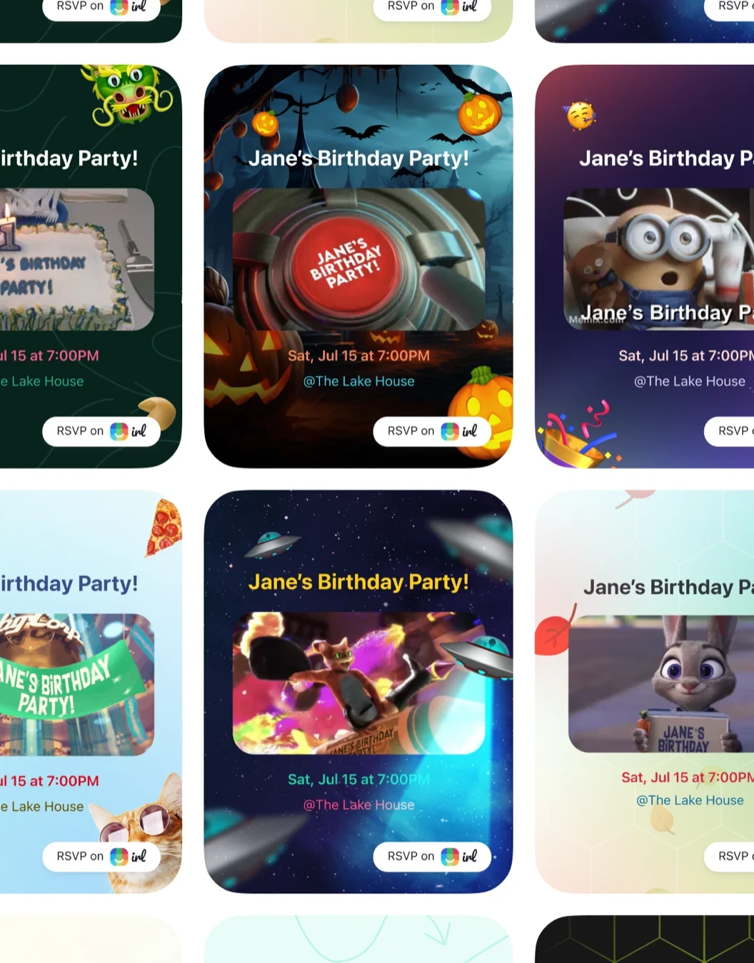
Event sharing templates
Designed interactive share templates with animation support.
- established a theming system that could carry expressive, high-variance UI without turning each template into a special case
- variants followed shared anatomy and motion rules. Theming carried the difference between templates.
07. Convergence
The two tracks met where features fed back into the system.
The user-color logic was a feature problem first - polls and shared objects needed to carry author identity. It became a token model. Once it lived as aliases, every new shared surface inherited the same logic by default. The same loop repeated for share templates, profile metadata, and Explore blocks.
That feedback loop is the part the system layer alone can't tell you about. It's also the part the feature layer alone can't earn. They had to happen in the same hands.
08. Result
What changed
A shared system layer replaced ad-hoc UI decisions across iOS, Android, and Web. A single token source in Git removed the translation layer between design and engineering.
- interface fragmentation stopped compounding because teams worked from the same model
- implementation became more predictable because constraints and behavior were clear
- design crits collapsed from a recurring meeting cadence to a single weekly async showcase
BeforeOutcomes varied by team, platform, and individual interpretation.
AfterConsistency and accessibility became the baseline, without slowing delivery.
Adoption became practical because the system was already embedded in shipping work. New surfaces reused the same token layer, component rules, and platform logic.
Designs are copyright protected by Get Together, Inc. and are used with permission.